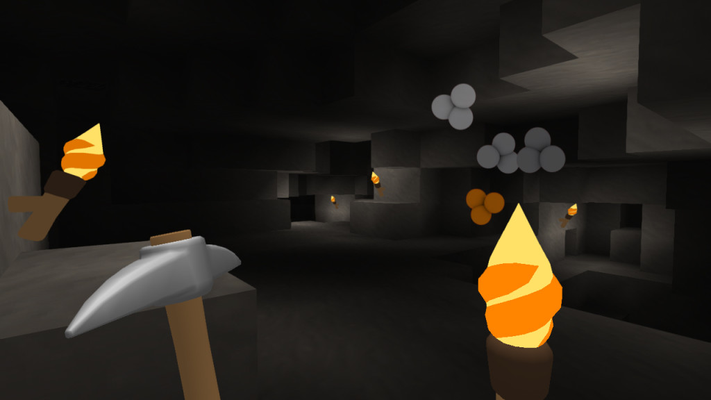
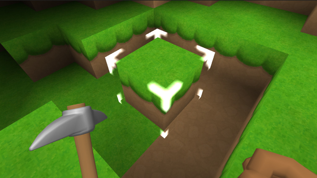
Over the weekend, I managed to work on more things. One is that caves now look nicer after doing some refining of the cave generation algorithm. Took one weekend to do. Perlin noise is always fun (NOT). The other thing, a more minor but necessary change is that the block highlighter is a lot less obtrusively. This makes it look cleaner, as well, and doesn’t obscure the visuals too much like the older one.
Have a few more things on my To Do list to prepare for the 1.1 update. This includes pro controller support, classic controller support, and Off-TV gameplay that everyone wants. Being able to play only on the gamepad is a nice feature that I hate did not make it into the first build, but will surely be making it a thing this time around. Who doesn’t want to lie in the comfort of their bed and play a little block building? Or use their favorite control peripheral?


Cordero awesome work on the game i love this game and i am really looking forward to the Update :D my Miiverse is IsaacSBMCB